Style and Up-to-Dateness
Office Block, Kacsa Street, Budapest

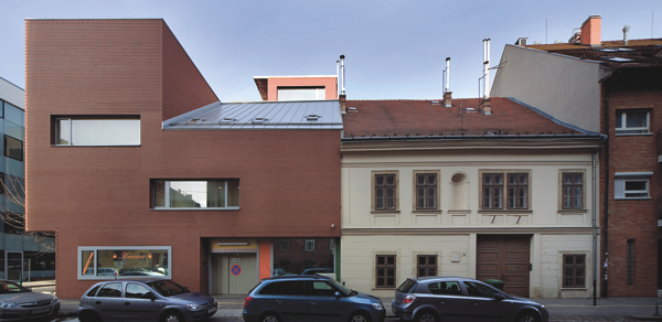
The first thing striking us that it is not a bodywork-like, a UFO-object, a veil inspired by fine arts, a symbolic sign, or an image referring to something else ŌĆō even though it does create a very familiar spatial situation and marks the corner in a highly influential way. It is an expressedly house-like, tectonic creation having vertical walls with brick facework, large aluminium windows, cornices, bracketed projections, a roof and a roof terrace. ┬ĀIt appears as if it could have a story of its own. Such as the corner design, for example.
With a facade of varied heights, it is a development in unbroken row set on an oblong corner telek on a widening lowland north of Viziv├Īros (ŌĆ×WatertownŌĆØ) facing the River Danube. Eclecticism had once shaped these corners with special care overburdening and overadorning them only to be replaced by the primitive and sharp butt modernism typical of the socialist era. The new urban forms of motion had broken up the closed shells long ago and for good, so now we have to orientate in diffused transitory spaces instead of the old intimate rooms. But the story goes on.
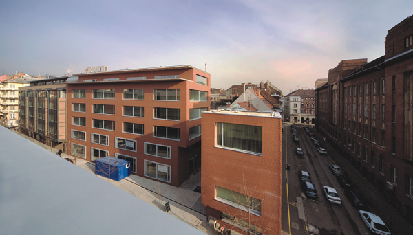
Here, on the corner of Kacsa and Gyorskocsi Streets, there is a tiny interval, emptiness, lane, precisely calculated and measured transitory space being sucked in ┬Āat the perpendicular meeting of the lines of the two streets and their development in unbroken rows offering release from the burden of the unpleasant forms and horizontal plan. But it has something else on offer too: the potentials of precise articulation instead of conformism. However, it required the building to be divided into two separate wings although the structure presupposes integrity and also a programme related to it. The result is the acceptance of cornice heights with a significant variety instead of the compulsion to conform and apply frustrated ŌĆ×stepped downŌĆØ accommodation which is simultaneously released in the positive-negative yin-yang play of a semi-corner turret and the transitory space of the entrance.
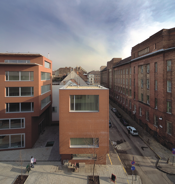
In the bigger wing the main walls drawn to the border of the plot ┬Āat the back ŌĆō applying the basic principle of parallel construction inherited from the heroic age of industrialized construction ŌĆō slightly breaking the angle of the facade plane of the development, all the entrances are directed to the foyer focussing every entrance. The building stetches out (or in) the space at its disposal, for which a mysterious background is provided by a modestly showing partition wall of the neighbouring two-storey residential building which is a listed monument.
The homogeneity of the two wings with characteristically different dimensions and position is served by the integral brick facework and the layout of openings piercing the facade also functioning as surface ornamentation. But the intensifying requirement of monolithic character inspired by the spirit of the age is only fulfilled in part because of the substantial assimilation of the neighbouring parts and the architectonic approach consistently applied instead of the attitude of sculptural arts.┬Ā
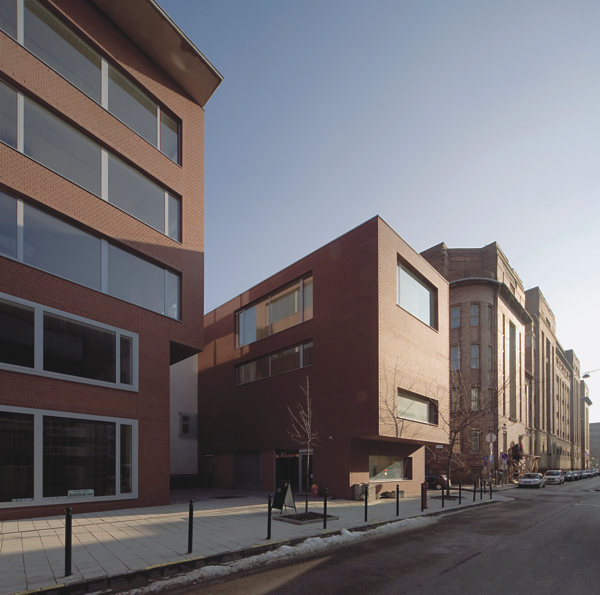
The window module of the horizontal rectangle of the six-storey facade towards the street is repeatedly and expressively shifted drawing the triple vertical rhythm of the plinth-field-roof finish and the horizontal of the main building-transitory space-corner building. Forms inspired more by abstract music than visuality bring us closer to the original and continuous profession of architecture ŌĆō to precisely assemble a variety of elements, fragments of memories of fantasy, matrices of regulations, structures, physical parts, remnants of space, dreams, the creation of new entities, that is the continuation of a narrative ŌĆō in an exciting way. We can see that the approach to time is at stake now in high-standard architecture.
Inspired by the sculptural and fine arts, in a black-and-white spatial structure (in amorphous and flowing diffused spaces around inclusion-like closed function boxes), thinking creators and authors emphasize and prefer the application of experimental change of place, the satisfaction of wanderlust, the identification within the flowing mass, the maximal utilization of technical faculties in their architecture alongside with many other achievements of design, advertising and the new informational-digital culture. Creating a kind of attractive visualized and total present they easily annihilate the possibility of continuing the narrative even against their own intentions. The art of assembly and compilation tends to look for analogies in geometry, mathematics and music instead, as the location, story and presence are all important for it. It goes on thinking in terms of rooms, halls, transitory spaces where people can spend much time if they wish overcoming emptiness attacking from both the outside and from within. The story is continued.
J├Īnos Golda
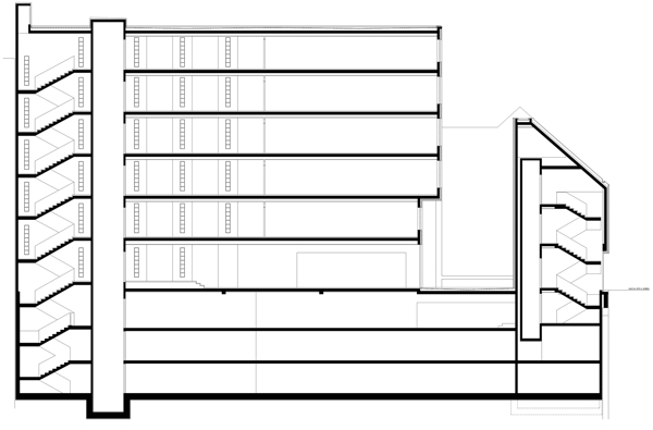
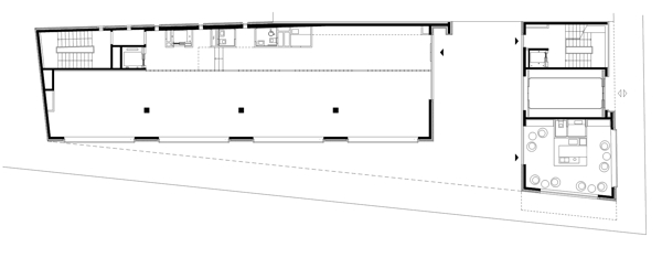
├ēp├Łt├®szet / architecture: Tomay Tam├Īs, Galina Zolt├Īn, Szab├│ Zolt├Īn ŌĆō M┼▒terem I./1. Kkt.
Statika / structure: Volkai J├Īnos (eng. terv) Kov├Īcs Istv├Īn (kiv. terv)
G├®p├®szet / installation: Oltvai Andr├Īs
Elektromos tervez├®s / electrical engineering: Kelemen Ferenc, Beharka Zsolt
