Friendly Sterility
TEVA Sterile Centre, Gödöllő
Architects: Antal Puhl, Péter Dajka
Text: Mária Tatai
Photos: Tamás Török / topogram.hu

TEVA is a Hebrew word meaning „nature”. Present also in Hungary from 1993 on, this multinational pharmaceutical works has a 20-hectare premises on the outskirts of Gödöllő reaching into the depths of a forest. Its latest development, the Sterile Centre was opened in autumn 2012 to house an industrial plant complex with the highest-standard technology.
Nowadays medicines play a primary role in the struggle to save lives, for health, recovery and the preservation of youthfulness. Pharmaceutical production ranks amongst the most profitable industries at present and as such, it keeps production technologies developed all the time ¬ we actually have state-of-the-art technology in this branch of industry.
Industrial architecture started to go on its own way in the age of Modernism, which is a pioneering type of architecture indeed. Industrial developments have been par excellence Modernist buildings as they had to meet their function and the production contained in them above all, especially in a rational, constructive and economical way. It was the industrial buildings that permitted for the first time to purely show structures, to expose spatial formation in mass formation and on the facades too. The design of the production halls were thus defined primarily by technology and economic efficiency, whilst it also had to be an environment acceptable for the people working there. 20th-century industrial architecture had to create its own aesthetics also in Hungary by making a virtue of from simplicity and rationality. By relying upon the relative freedom in mass formation and materials it was exactly this field that could come up with exemplary architecture as opposed to the construction of residential buildings or public buildings.
Industrial architecture has also undergone radical changes by now. However, it has retained its primary objectives – that is to serve technology, to apply rational and economical structures, forms adequate for functions. To meet the psychic expectations of the staff is also a priority in the most optimal cases as unevadable as the aspects of energy-saving and environment protection. The architects of the Sterile Centre managed to achieve much more besides all this: without compromising simplicity and the rational module-type organisation, they created a building complex communicating with its environment whilst it is an architecture not only adjusting to and reflecting it, but also expressing its inner functions. Completed by an aerial view, the photo of the complex expressively illustrates the strictly regular mass formation: the seven members of the complex contained in the huge rectangular structure made up of six brick buildings with almost identical production modules strung along a corridor that reaches out from a main building. The slight differences of these blocks result from the adjustment of the development to the undulating landscape of Gödöllő: depending on the inclination of the terrain: the lowest level is either under the ground or exposes its depths to various extent, whilst the site joins it with hills undulating in green from the north-western and north-eastern sides.
The premises of the factory make up a closed area: making a tour of the site is an experience reserved primarily for the people working here. However, it is exactly touring the development that highlights its unique architectural merits: despite the strict composition it offers a friendly and human-scale experience and not only because of the versatile terrain access and the high-standard landscape design. An important aspect of this is the articulation of the masses and the design of the facades. The four-storey complex is subdivided by 4-4 „atrium-slit” along its longer sides. The atriums have floor covering of large white pebbles interspersed with green glass ones: these are materials and colours matching sterility. Giant-size white flower-pot shapes with trees in leaf planted into them appear here within the narrow white stone-gardens that represent the chief agents shaping the surrounding natural environment.
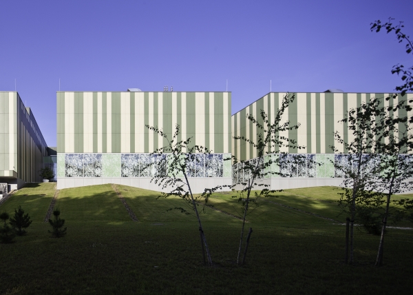
The materials, articulation and palette of the elevations are further proofs of architectural ingenuity. The lowest level, where it actually grows out of the earth, is made up of larger grey components, fittingly to a plinth. Because of the adjacent undulating green slopes it is only visible from a distance and thus sort of underlines the building itself. The second level is a glass lane vertically articulated all around to create a green surface of a pattern representing foliage alternating transparent and opaque, partly reflective effects. This is the level where production is housed. We can hardly look behind the facade: it is only some fragments of the furnishing that may outline at most, and the curious eye gues at the movements of a figure in a space-suit now and then, here and there behind the mysterious glass curtain. The upper floors are clad in tiles reinforced with concrete, the panels of which are laid in a random system with a single and double width to make green and cream-coloured vertical stripes. The smooth facework may remind us of wrapping material – which could be justified by the fact that it conceals the spaces of engineering –, but the playful changes of lights and shadows break this surface and thus make this envelope almost live too. The three-storey butt-walls on the southwestern side may as well evoke the Venetian Doge Palace with the pastel palette, the more solid wall surfaces above the densely pierced lower walls – and although the proportions are slightly different, even they are suggested to some extent…
Containing the entrance and the foyer, the mixed-function main building is clad in a double-shelled glass surface hung along its length with point-holding. On entering it, we are surrounded by rectangular transparent and translucent glass walls that shimmer white fittingly to sterility. To get into the production area one would need to change clothes several times and wear protective wear, thus an outsider will only have some information about the interiors via plans and photos. The public description of the building is reticent: „Each applied industrial structure of the production areas was made to meet the criteria of clear space.” There is a closed artificial world inside which is a black box for us only accessible for the initiated ones provided they are also cleaned and wear space-suit. After all there is a kind of alchemical activity going on there to produce elixirs as precious as gold. It is not by chance perhaps that the rectangle containing the complex has a floor-plan measuring 100.2 x 63.2 m, which rate is 1.6, that is almost exactly the golden section.
The space-suit separates the human being who is also the mover of the technology from the asceptically clear space. It is an exciting contradiction that a lifeless, artificial world must be created in order to produce matters curing life. The crafty architects, however, connect people working inside with nature via a kind of saving „umbilical cord”, counteracting „the space capsule effect” by the screened glass partition: those staying in can see the wide world outside even if only via repeated glass-breaking. Closedness and openness, an extremely artificial environment and communication with nature all characterise simultaneously the architecture of this state-of-the-art witches’ kitchen.
Architecture: Puhl és Dajka Építész Iroda Kft.
Leading architects: Antal Puhl, Péter Dajka
Fellow architects: Ágnes Drabant, Tamás Huszár, Kitti Kalcsó, Réka Mészáros
Structure: Gábor Romits, Zsolt Kalmár – Hatolkay és Társai Kft.
HVAC: János Péter Bánhalmi – Bánhalmi Épületgépészeti Kft
Eelectrical engineering: Zoltán Ivanics – Provill Kft.
Outdoor public utilities: Zoltán Szilágyi, Andrásné Kovács – Mélyterv Kft
Environment: Anikó Andor – LAND-A Kft.
Roads: Dr. Zoltán Havasi – ÚTI-H Bt.
Technology: Balázs Vígh, Tibor Oláh – Cooptech Kft.
Fire protection: Antal Bársony
Acoustics: Éva Borsiné Arató – Arató Kft.


