Packaging Technology Illusion
Cladding the Store Building of Richter
Architects: Csaba Nagy, Dániel Déri, Judit Kováts, Bence Várhidi
Text: Krisztián Dudics
Photos: Tamás Bujnovszky

The Richter Pharmaceutical Company tends to build with slow-paced consistency: whatever must be touched will require high standards. After the research building and the swimming-pool it is now an uninteresting structure that gave the apropos for an interesting architectural play: however, this can affect the district as well as the image of the company itself.
What is given is an eight-storey windowless entirely functional store building as a prism with a rectangular floor-plan built back in the 1970s that, being „ugly”, ultimately meets all the clichés we have of the industrial zone in Kőbánya. I do not suppose that anyone would be inspired to think about architecture when seeing it… unless the owner of the building realizes the potentials in the engineering upgrading of the store planned by the management as well as the heat insulation of its envelope. Actually, this recognition is the result of an ultimately simple, rational, conservative and yet progressive approach: in the case of each intervention affecting the existing building stock all the potentials must be analysed carefully, and then within the limits of rationality high-standard quality is to be created. The latter has many layers: the artificial environment serves first of all the needs of the working processes and the workers, secondly the creation and operation must be economical, thirdly we should not forget about the prestige-demands of the internationally recorded company. If all this is given, then it usually entails as a surplus the sort of architecture which has the potentials to give a positive impulse to the district, the city as well as to contemporary Hungarian architecture.
In this case considerations of city planning have come into focus probably because the building with its height and mass is a prominent constituent of the view that opens up when we approach it from Gyömrői Street. Although it is not the kind of district in which one can admire when promenading or sitting on the terrace of a café, the dynamic visual impression exposed when approached by a vehicle is even more characteristic. This large-scale static building and its temporary dynamic exposure was the starting point for the architects to create something unique. Characteristic of the profoundness of the Richter and its senior architect that four famous architects were invited for this small-scale project within a miniature competition and of course they agreed to compromise with the design council of the district about the conceptions taking shape.
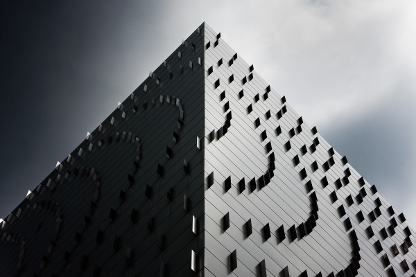
Designers from the winner Archikon architects’ team, Csaba Nagy and his fellow architects looked for and found a rational, economically realizable facade design that gives a dynamic overall impression with the always-changing views of the building opening up from a distance when approached by car, whilst also erecting a new sign for the district functioning as a point of reference. The intended effect – similar to many natural procedures and the structuring of organisms – was achieved by applying an ultimately simple algorhythm and experimenting to select the materials, colours and proportions that would best highlight it. Perpendicularly projecting from the vertical teeth of the ventillated white panelled metal plating , the stainless steel lamellas create a whirling and pulsing pattern that moves on like a kaleidoscope when the viewpoint changes with the simple means that the metal panels of the plating are shifted in the rows above each other by a distance growing 8-8 centimetres. The overall impression is light and elegant as well as playful, and by all means memorable: the white colour from the very beginning dematerialises the building and the reflections of the stainless steel surfaces enrich its views with a variety depending on the changing light conditions at all times and from every vantage point. What is even more, now and then even the edges of the building seem to disappear thanks to the pattern turning over. With this op-art-effect graphic art, sculpture and architecture come to integrate – and all this happening on a store building, what is even more: for fun. Could we ask for the same elsewhere too?
Architects: Csaba Nagy, Dániel Déri, Judit Kováts, Bence Várhidi – ARCHIKON Kft.
Structure: Orsolya Dudinszky
Framework: Tibor Pintér
Electrical engineerig: Károly Dorgai
Client: Richter Gedeon Nyrt.


